
Yes, Total Deaths in U.S. ARE Up in 2020
Making the rounds on social media and alternative news websites is the story about a Johns Hopkins study that claimed COVID-19 deaths are overstated. The work in question can still be found on the Wayback Web Archive here. It measured total U.S. deaths from all causes during 2020 and concluded that these deaths – from all causes – were not greater than deaths in previous years.
Skeptics were quick to pounce. For example, in this report, an alternative content provider led with the headline “Study: Absolutely NO excess deaths from COVID-19.” Then when Johns Hopkins pulled down the study, the plot thickened. Here is a typical reaction to that, “Johns Hopkins Publishes Study Saying COVID-19 Deaths Overblown, Then Deletes It.”
When Johns Hopkins took the study down, they published an explanation which only clarified some of the issues raised by the study. To the main point, which was that deaths from all causes in the U.S. are not higher in 2020 than in previous years, Johns Hopkins wrote “This claim is incorrect… according to the CDC, there have been almost 300,000 excess deaths due to COVID-19.”
But Johns Hopkins did not explain, or even speculate, as to where the author of the retracted study (which really was just an article in their newsletter, not a study) got their figures. But there’s a fairly likely explanation, because this isn’t the first time something like this has happened this year.
Back in July, a meme went viral claiming, ironically, that “COVID-19 Cured Pneumonia.” As noted in an article investigating this meme, the data used by the author of the meme was “CDC Reported U.S. Pneumonia Deaths 2019-20” through March 25, 2020. They showed these deaths on a graph where the line representing current year pneumonia deaths was clearly way below the lines showing prior year pneumonia deaths. Ergo, the CDC was reclassifying pneumonia deaths as COVID deaths to inflate the COVID death statistics.
Except they probably weren’t, or if they were, it was not nearly to the extent this meme inferred. What the author of that meme did, and apparently what the author of the article published by Johns Hopkins did, was fail to take into account the 10 week lag between when deaths are reported first reported for a given week, and when all the deaths in that week are finally collected and tabulated. Typically, only about 25-30 percent of deaths in any given week are logged and reported by the CDC in the immediate following week. Only after 8-10 weeks, after that many weekly updates, are 95+ percent of deaths in any given week reported and known.
This means that for any point in time, a graph where the CDC’s current year data is superimposed against their prior year data will only show an accurate comparison if you ignore the most recent ten weeks of current year data. Those weeks will always show a downward curve because all the data for those recent weeks is not yet received by the CDC.
The author of the article published by Johns Hopkins did have a useful insight, however, by focusing only on “deaths from all causes.” This eliminates the question of misclassification and merely asks the question: are more people dying this year than in previous years, or not? The CDC issues reports weekly, and each time they arrive in spreadsheet format, showing how many people died, per week, for every week preceding the week of the report. Here, for example, is a link to the CDC’s weekly report for the week ended 11/24.
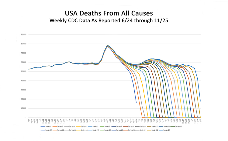
Presented below is CDC data on U.S. deaths from all causes for this year. It graphically depicts the data from 23 weekly reports from the CDC, starting on week 25 (the week ending 6/24), through week 47 (the week ending 11/24). Each report is one line on the graph. The vertical axis represents the number of deaths, the horizontal axis represents weeks in 2020.
Note how each week of data plummets towards zero as it plots the more recent weekly total deaths. Note as well how the earlier weeks, where all data has been collected, show these lines all converging. This shows graphically how the CDC’s weekly reports do not provide complete totals for the weeks immediately preceding each of their reports. Only the data 8-10 weeks behind any CDC weekly report can be relied on to show how many people actually died.
With this knowledge, we can now reliably compare weekly deaths from all causes in the U.S. in 2020 and compare it to the averages for those same weeks in previous years. The next graph, below, does this, but uses a two year horizontal axis to allow a clear visual representation of the historic cycle in previous years, where deaths go up in the winter and down in the summer. To make this clear, the horizontal axis starts on October 1, which is the beginning of flu season, then tracks 104 weekly data points, representing two flu seasons over two full years. The choice of two years is also helpful to track COVID’s impact, since it did not follow the typical trajectory where deaths peaked in winter.
As can be seen, there are six years of prior year data that track in close formation. The 2017-2018 flu season stands out as the most severe, with deaths peaking in January at nearly 70,000 per week. Overall, during the peak weeks of flu season over the past six years prior to 2020, total deaths in the U.S. rose to not quite 60,000 per week, then dropped in mid summer to around 50,000 per week. That is the normal progression.
Against that backdrop, the dark blue line, which represents total deaths from all causes in 2020, offers a very different curve. Flu season was normal, with deaths plateaued around 60,000 per week for several weeks in January and February. But then deaths spiked dramatically in March and April of 2020, during a time when typically deaths from all causes start to cycle slightly downwards. The sharp peak in April clearly shows that something very alarming was happening, with the week of April 15 peaking at 78,821 deaths, around 15,000 deaths higher, or 46 percent higher, than what should have been typical for that week.
Further review of this graph shows what was referred to as the 2nd wave of the COVID pandemic, when total deaths peaked again at 63,867 on the week of July 29, roughly 12,000 deaths higher, or 23 percent higher, than what should have been typical in the middle of the summer. But here is where it gets interesting. Based on the CDC’s time lag in getting information, the accuracy of the 2020 curve is only available through mid-September. The numbers already reported show deaths from all causes still well above the previous six years, but it is too soon to know if they will continue to rise or not. That is where we stand right now.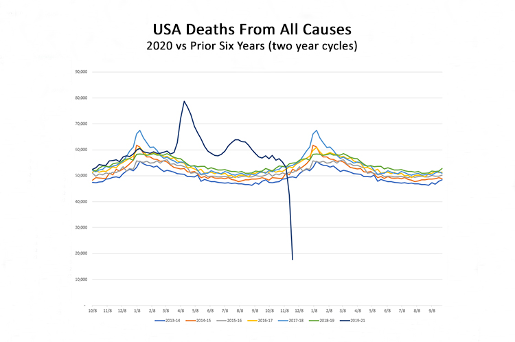
To dispense with these graphs, and return to just numbers, the question remains: If the author of the article published with Johns Hopkins was mistaken, and they were, then exactly how many excess deaths are there really in 2020, from all causes, compared to prior years? We can know this with relative precision for 2020 through the CDC report for the week ended September 16.
For the calendar years 2014-2019, through September 16, the number of deaths from all causes (adjusted for population growth) was 1,991,648. For 2020 through September 16, the number of deaths from all causes is 2,302,633. This means that over the 37 weeks of 2020 through September 16, there were 310,985 more deaths in the United States than should be expected based on the averages from the six preceding years.
This fact, that during 2020, 310,000 people in the United States are dead who, if this were a normal year, would still be alive, means that at the very least we are not dealing with a hoax. And while the pandemic shutdown may be killing jobs and robbing thousands of people of their will to live, suicides alone cannot begin to explain the spike in deaths back in April, when these lockdowns had barely begun, and total deaths were 46 percent above the average for a normal week in April.
The point of this analysis is not to suggest the measures that government officials – federal, state and local – have taken are the correct measures. Some states have done better than others at managing this crisis, and most everyone has had to deal with unknowns and uncertainties in a situation where the stakes could hardly be any higher. And for those who are conspiracy minded enough to think this disease is not all that serious, based on the fact that most of its victims are older people with serious preexisting health conditions, then they ought to be conspiracy minded enough to realize that if this pandemic doesn’t get everyone into line, then the next one will be engineered to be deadlier. How much of a skeptic do you have to be these days to consider the chance that COVID-19 spontaneously arose in a Chinese “wet market” vs the chance that it was engineered and spread deliberately to be an even bet?
Ultimately, however, in an age when you can’t trust anything coming from the media, and less than ever from the government, maybe this analysis is a useful way to remind us all that even if we’re dealing with official misinformation on almost everything that matters, that doesn’t mean that everything we’re fed, every single time, is false.
It is probably a reasonably safe bet that the data presented by the CDC on weekly deaths from all causes in America is accurate, once you take into account the lag in getting all the data compiled. And it is also reasonable to question alternative media as diligently as we question official media. We live in an age of information war, and as in any war, both sides have their inevitable share of charlatans, hacks, and just plain careless players.
This article originally appeared on the website American Greatness.
* * *

Edward Ring is a contributing editor and senior fellow with the California Policy Center, which he co-founded in 2013 and served as its first president. He is also a senior fellow with the Center for American Greatness, and a regular contributor to the California Globe. His work has appeared in the Los Angeles Times, the Wall Street Journal, the Economist, Forbes, and other media outlets.
To help support more content and policy analysis like this, please click here.
Leave a Reply
Want to join the discussion?Feel free to contribute!